
#visualizing: A network map of your connection on Linkedin
by bernt & torsten
Have you wanted to visualize the data that exists on your Linkedin account, I will be showing ways how you can download your data from Linkedin and use Python Notebook to make different visualization of your LinkedIn data to get a deeper understanding of your connections and contacts.
Network Graph
A great way to visualize your connections is with a Network graph, with you in the centre node you can visualize the companies and the title of your connections, there are many other ways you can use your LinkedIn data to do visualize. Another example would be to see the social connections between you and your connections.
Treemap
You can use treemapping to display hierarchical data using nested figures, usually rectangles. Here is an example of a treemap with Linkedin data to show the connections title and in which company. There are many ways you can use the data to make a treemap visualization.

Python Notebook
For you to be able to do this on your own, I have put the Python code in a Python notebook so you can try this on your own. Here is the beautiful basic Python code for Linkedin data.

Tech Disillusionment
For four decades, I have worked in the tech industry. I started in the 1980s when computing...

A Poem: The Consultant's Message
On a Friday, cold and gray,
The message came, sharp as steel,
Not from those we...
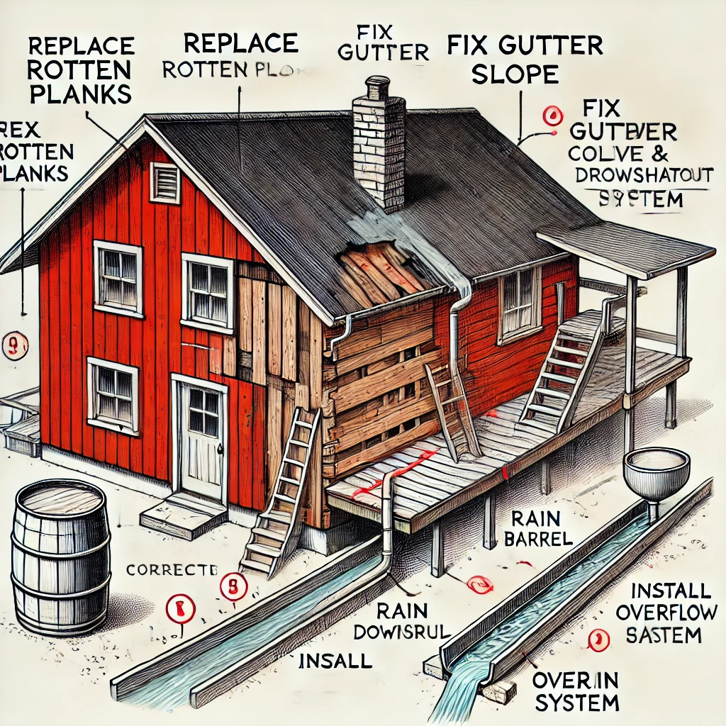
Using AI to Plan Wall Repair and Gutter Installation
In this article, I will share my experience using AI to plan the work required to fix a wall...