
Great new Visualisation starting the new 2020 decade with
by bernt & torsten
New decade an all, I have always been fascinated by visualizations that tell a story about our world, for the good or the bad. I have come across some great new Visualisation to start the 2020 decade with, as many of us have seen in the news, the Coronavirus outbreak, the Australia fire has caught my attention as well as my interest in how we spend our time. I wrote an article on you have a problem if you always busy, I come across a visualization by Financial Times (FT) about weekend working. I’m sharing these visualizations with you, enjoy.
Tracking Coronavirus in Real-Time
Since the beginning of 2020, China has been infected with a deadly coronavirus that has no cure yet and is now spreading around the world. Since the outbreak over 14,000 people worldwide, with over 250 deaths in China and the first death outside of Chine. It’s hard to keep track on which locations are impacted by the coronavirus, the visualization Tracking Coronavirus in Real-Time by the Johns Hopkins provides a clear view of which countries have reported coronavirus cases and were the deaths have occurred.
Looking at the technology behind, from a data collection perspective Google Sheets has been used to report on a daily basis the coronavirus cases and the time series data, for the visualization dashboard the ArcGIS. The dashboard is clean gives exact information, and shows how the coronavirus cases are increasing in China and outside China.
As you read your local news about the coronavirus, don’t forget to keep an eye on the Tracking Coronavirus in Real-Time (Johns Hopkins CSSE) dashboard as these guys behind the dashboard have done a great job of ensuring the world is in the know of the status of this potential virus. As reporting on cases and potential deaths is very sensitive, we can not forget the people that have been affected by the illness.
The Truth About Working
This visualization The Truth About Working by Financial Times provides insight into how most United Kingdom adults spend their days, both as a weekend and weekday. By breaking up the daily activities that we do, we can see how the time is spent throughout the hours of the day.
Credit to HowMuch.net, a financial literacy website
The visualization can tell us a lot about how time is spent. If you are curious about how others spend their time, you can compare your behavior to how people spend their time:
- How much time you sleep weekday/weekend compared to others
- When do others do their chorus
- How much TV/Video/Audio you consume compared to others
When you browse over the visualization you can compare your habits with the individuals that shared information for The Truth About Working (Financial Times).
Sizing up Australia’s Bushfires
Reuters Graphic has created visualizations on the Australian fires and the visualization shows a different nature of the Australian fire from some of the other fire catastrophes of 2019.
Credit to HowMuch.net, a financial literacy website
The burned area in Australia during this bushfire season is larger than the area burned in Brazil’s Amazon region during the whole of 2019.
On the Reuters Graphic website, you can read more about the Australia Bushfires Scale
California’s fire season was not as active as previous years but almost 19,000 sq km of land was razed in 2019.
In Indonesia, farmers razed huge swathes of forest and peatland in slash-and-burn operations that happen each year, creating a blanket of smoke that clouded the skies over large parts of Southeast Asia.
The area burned in the Amazon, Indonesia, and California combined still amount to less than half that in Australia.

Tech Disillusionment
For four decades, I have worked in the tech industry. I started in the 1980s when computing...
A Poem: The Consultant's Message
On a Friday, cold and gray,
The message came, sharp as steel,
Not from those we...
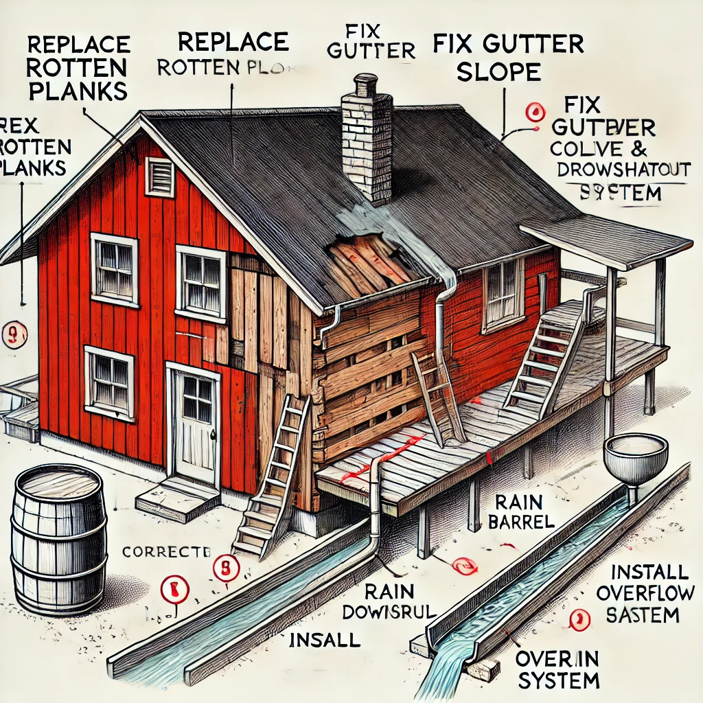
Using AI to Plan Wall Repair and Gutter Installation
In this article, I will share my experience using AI to plan the work required to fix a wall...